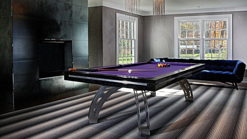
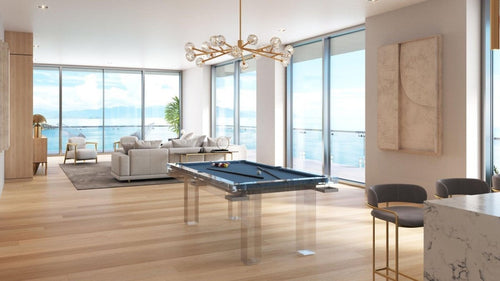
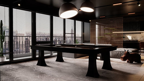
Enjoy our modern designs
Estimated Read Time: 6 mins |
The golden section—expressed as the ratio 1 : 1.618—has guided design for over two thousand years. From the Parthenon’s elevations to Le Corbusier’s Modulor, this self‑replicating proportion offers an intuitive sense of balance that resonates across cultures and eras. When applied to interiors, it turns the guesswork of “what feels right” into a repeatable geometry you can leverage at any scale.
Understanding the Ratio
The golden section divides a line so the smaller segment relates to the larger as the larger relates to the whole. That mathematical constant (phi) underpins the golden rectangle: cut off a square and the leftover rectangle mirrors the same ratio, allowing endless subdivision. This self‑similarity is what makes spaces based on phi feel naturally cohesive—the parts echo the whole.
Historical Snapshots
| Era | Application |
|---|---|
| Classical Greece | Temple column spacing and façade grids followed near‑golden ratios, creating enduring monuments. |
| Renaissance | Artists and architects embedded phi in paintings, domes, and chapels to capture ideal human and divine harmony. |
| Modernism | Le Corbusier’s Modulor merged golden‑section math with human measurements; Giuseppe Terragni organized entire building plans with golden rectangles. |
| Contemporary Interiors | Designers employ golden overlays in CAD, guiding everything from room footprints to tile layouts and color blocking. |
Practical Interior Applications
Room Proportions
- Target a length‑to‑width ratio close to 1 : 1.618.
- Preserve a square sub‑zone—reading nook, seating pit, display bay—inside the rectangle so the classic geometry reads.
Wall Divisions & Millwork
- Set chair‑rail heights, wainscot panels, or shelving bays at golden ratio breakpoints.
- Place a focal element (fireplace, art cluster) in the long field; balance storage or display in the short.
Furniture Spacing
- Coffee‑table length ≈ 0.618 of sofa length for comfortable reach and rhythmic proportion.
- Dining clearance equals roughly 0.618 of the tabletop width—plenty of pull‑out space without dead floor.
Color & Pattern Distribution
- Let the dominant hue cover roughly 62 % of the scheme, with a secondary at 38 %.
- Pair a large‑scale pattern (drapes) with a 0.618‑scaled motif (pillows) to keep energy in balance.
Digital Tools & On‑Site Tricks
- Golden Grid Overlay: Import a transparent phi grid into CAD or SketchUp to snap walls, windows, and built‑ins to ratio points.
- Modulor Cheatsheet: Start with Le Corbusier’s ergonomic heights (1.83 m, 1.13 m), then multiply or divide by 1.618 for countertop, desk, and shelf dimensions.
- Pattern Tester: Print two scales of a pattern; trim one to 0.618 of the other. Pin both on site—the proportion that feels “right” almost always aligns with phi.
When to Flex the Rule
- Tiny Spaces: In powder rooms or narrow corridors under 1.5 m wide, circulation and code clearances outweigh strict geometry.
- Historic Symmetry: Period interiors with rigid axial layouts may benefit more from mirrored symmetry than golden asymmetry.
- Human Comfort: If a phi‑perfect layout forces awkward reach distances or cramped circulation, adjust by eye—function comes first.
Key Takeaway
The golden section is more than an ancient curiosity; it’s a ready‑made framework for balance. Applied from room footprints to cushion groupings, the 1 : 1.618 ratio delivers automatic harmony. Use it as a guiding grid—then refine by function and feel—and watch every element click into place with timeless elegance.


