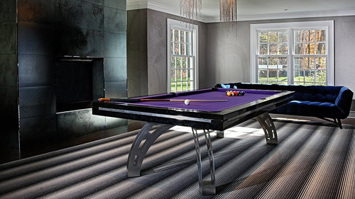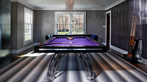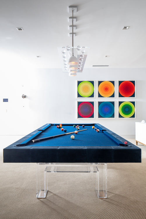

Enjoy our modern designs
Estimated Read Time: 5 mins |
Color is central to the way we experience a room, but accurately specifying and communicating color isn’t as simple as saying “light blue” or “deep red.” For interior designers, color management is both art and science—one supported by robust systems like Munsell, Pantone®, and CIE. Each framework helps translate color from mere concept to tangible reality, ensuring that what the designer envisions is exactly what gets produced.
Why Interior Designers Rely on Color Systems
When dealing with paint manufacturers, textile producers, and furniture suppliers, ambiguous color names often lead to miscommunication. In contrast, objective color systems provide a precise, universal language, allowing designers and manufacturers to align on specific notations and references—essential for creating cohesive, high-quality interiors.
Munsell: A Perceptual Foundation

Established to bring order to how we identify and discuss color, the Munsell System examines three key attributes:
- Hue: The color family or category (e.g., red, yellow, green).
- Value: The degree of lightness or darkness.
- Chroma: The intensity or saturation.
With a structured approach using principal and intermediate hues along with a vertical value scale, Munsell allows designers to specify exact values—like 5R 5/14—communicating precise details to suppliers.
Pantone®: The Industry-Recognized Standard

For many designers, Pantone® is the go-to resource. Its widespread industry adoption ensures color consistency across diverse materials and finishes—from custom wall hues to upholstery selections.
- Real-World Application: Share a Pantone® reference to guarantee consistency in products like textiles and paints.
- Versatility: Pantone® unifies color stories across various design elements.
CIE: The Scientific Bedrock

The CIE (Commission Internationale de l’Eclairage) standards form the scientific foundation for color measurement, providing precise chromaticity coordinates (x, y) by analyzing reflected light and human vision sensitivity.
- Industry Adoption: American furniture manufacturers often rely on CIE for color consistency.
- Scientific Rigor: These data-driven models ensure physical-level color accuracy, critical for commercial and custom projects.
Beyond Basic Color Names
Collectively, these systems—Munsell, Pantone®, and CIE—transform subjective color ideas into objective, measurable references. This robust methodology enables designers to achieve predictable outcomes, improved collaboration, and enhanced aesthetics in every project.
The Power of a Shared Color Language
Standardized color systems allow designers to articulate their vision with nuance and precision—whether overseeing complex commercial projects or fine-tuning residential interiors. By leveraging these frameworks, you bridge the gap between aspirational mood boards and tangible results.
Looking to integrate standardized color practices into your next project? Embrace the power of a shared color language to ensure your design meets and exceeds client expectations.