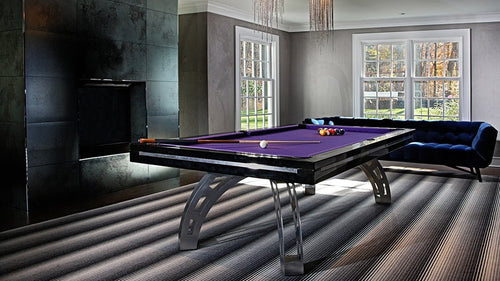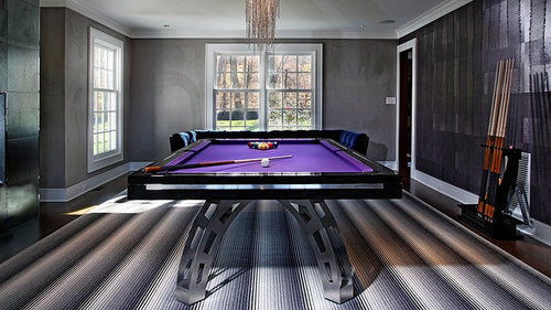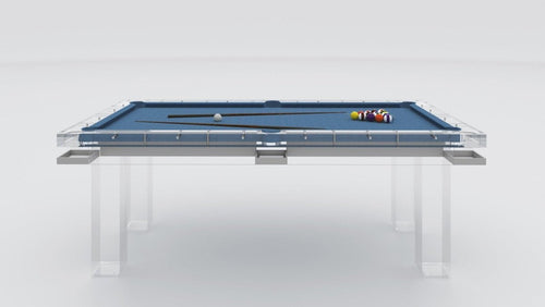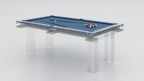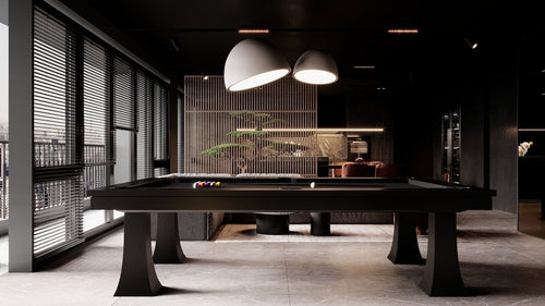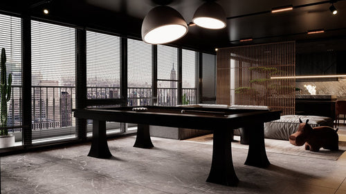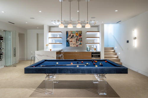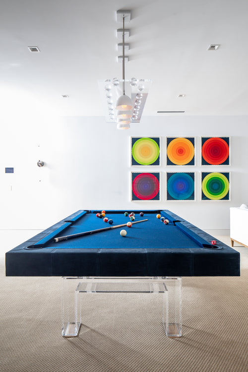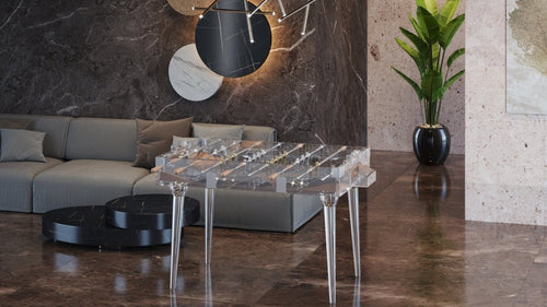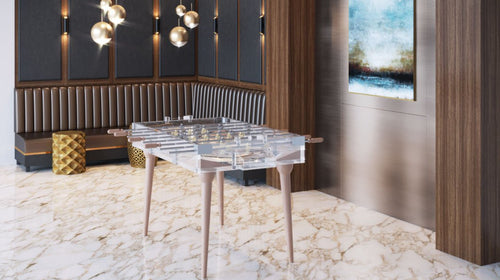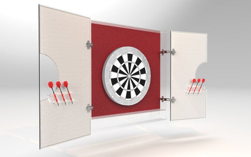

Enjoy our modern designs
Design Logic & History
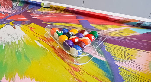
Pool Ball
Colors
The classic solids and stripes palette isn't random — it's engineered for contrast, recognition, and a clean pairing logic. Here's why every ball is the color it is.
Those colors aren't decorative. The standard scheme of solids (1–7) and stripes (9–15) was designed for maximum contrast, instant identification, and a simple pairing logic that holds up under poor lighting, green cloth, and pressure. Here's the breakdown.
✦
1·9
Balls 1 & 9
Yellow
2·10
Balls 2 & 10
Blue
3·11
Balls 3 & 11
Red
4·12
Balls 4 & 12
Purple
5·13
Balls 5 & 13
Orange
6·14
Balls 6 & 14
Green
7·15
Balls 7 & 15
Maroon
8
Ball 8
Black
CUE
Cue Ball
White
Pattern Logic
Each stripe shares the exact color of its solid counterpart. Add 8 to any solid number to get its stripe pair: 1→9, 2→10, all the way through 7→15. This simple rule means every color appears exactly twice in the set — once as a solid, once as a stripe — making recognition under pressure automatic rather than calculated.
The Design Logic
Why These Colors?
Primary
Widest Separation
Yellow, blue, and red sit at maximum distance from each other on the color wheel — producing the highest possible contrast between three hues. These three anchor the set.
1
2
3
Secondary
Logical Mixes
Purple (blue + red), orange (red + yellow), and green (yellow + blue) are the three secondary colors. Each is distinct from its parents while maintaining visual logic across the full set.
4
5
6
Tertiary + Anchors
Completing the Set
Maroon completes seven unique hues as the sole tertiary. Black (8-ball) and white (cue ball) anchor both ends of the value scale, maximising contrast with every other ball on the table.
7
8
CB
The 8-ball is black and the cue ball is white — maximizing contrast with everything else on the table. It's not tradition. It's engineering.— On the design intent behind the standard palette
Where It Breaks Down
The Visibility
Problem
The standard palette performs well under ideal conditions, but three factors erode its clarity: dark green cloth absorbs contrast, poor venue lighting muddies hue differences, and on TV or streaming, deep blue (2/10) and purple (4/12) can appear nearly identical to each other. This is the problem that alternative broadcast sets were designed to solve.
Alternatives
Alternative
Color Schemes
Broadcast
Aramith TV Balls
Swaps purple (4/12) for pink to create clear separation from blue on camera. Improves broadcast legibility but can approach red or orange under certain studio lighting — a partial fix rather than a complete solution.
Visibility Set
Cyclop "Skittle"
Introduces light green and cyan for balls 6/14 and 7/15. Helps visibility in specific environments but risks blending against teal or blue-tinted cloths — solving one problem while introducing another.
Streaming
Neon & High-Gloss
Saturated neons and high-gloss finishes optimized for camera pop and social media clips. Visually striking, but purists note that they sacrifice the color harmony and classical balance of the traditional set.
Accessibility
Pool & the
Color-Blind Player
Approximately 8% of men and 0.5% of women have some form of color-vision deficiency. The two most common problem pairs in a standard set are red and green (balls 3/11 vs 6/14) and blue and purple (balls 2/10 vs 4/12) — the same combinations that cause difficulties on broadcast.
Practical Solutions
Rely on numbers first. The number on every ball is the primary identifier — color is the secondary. Choose sets with larger, bolder numerals if visual discrimination is a concern. Some manufacturers offer high-contrast number printing specifically for this reason.
Choose Tournament Blue cloth. The cooler, higher-contrast surface reduces the specific blending issues between red/maroon and the cloth itself, improving discrimination for all players regardless of color vision.
Hidden Structure
The Math
in the Rack
The color pairing logic produces some interesting arithmetic: all solid/stripe pairs sum to even numbers (1+9=10, 2+10=12, through to 7+15=22). Groups of balls on opposite sides of a standard rack frequently sum to matching totals. The set is symmetrical in ways that go beyond the visual — there is a quiet mathematical logic built into every standard rack you've ever broken.
Common Questions
FAQ
-
Why are pool balls colored differently instead of all the same?
For instant identification under pressure and in low light. When you're scanning fifteen balls to locate your next shot, uniform balls would require reading each number individually. Distinct colors let the eye group and locate in a single glance.
-
Why does ball 7/15 look different from the others?
Maroon is the sole tertiary hue in the set — it completes seven distinct colors without repeating any primary or secondary. It deliberately sits at the darker end of the spectrum to maintain differentiation from red (3/11) despite being in the same general family.
-
What's the actual difference between TV balls and a regular set?
TV sets (most commonly Aramith's broadcast specification) replace purple with pink on balls 4 and 12. That single swap is enough to create clear separation from blue on standard broadcast cameras, which struggle with the blue-purple distinction more than the human eye does in person.
-
Can color-blind players compete at a normal level?
Yes — numbers do the heavy lifting, and most players develop number-first recognition regardless of color vision. High-contrast ball sets and appropriate cloth colors remove most practical obstacles for competitive play.
// Final Verdict
The classic palette is a considered design — rooted in primary and secondary color theory, built around clean pairing logic, and anchored by the highest possible contrast at each end of the value scale. TV variants and streaming sets exist for specific visibility reasons, but tradition remains the clearest system for most play conditions. Those colors are part of the game's design, not decoration.