
Enjoy our modern designs
Estimated Read Time: 6 mins |
Texture isn’t just a supporting actor—it’s a primary design element. When you understand how surfaces absorb light, cast shadows, and interact with color, you can shape the entire mood of a room. Below is a straightforward playbook on using texture to create interiors that feel rich, balanced, and anything but flat.
Texture Basics: Visual vs. Tactile
| Type | Definition | Common Examples | Design Impact |
|---|---|---|---|
| Visual | Pattern you see first—created by natural graining, veining, or print. | Wood grain, stone veining, brick face | Adds subtle movement; catches side‑light |
| Tactile | Feel under the fingertips—produced by weave, pile, relief, or finish. | Linen upholstery, sisal carpet, velvet | Signals comfort or luxury; diffuses sound |
Pro tip: Pair at least three distinct textures—two rarely give enough contrast, while four or more risk visual clutter.
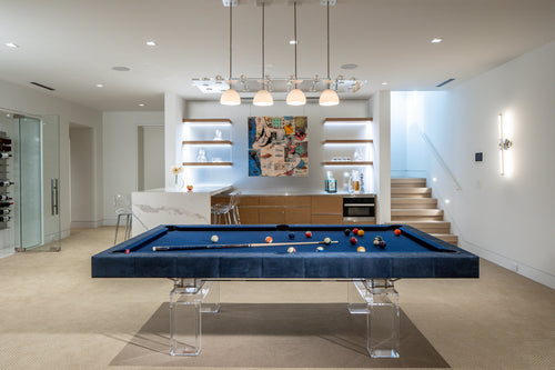
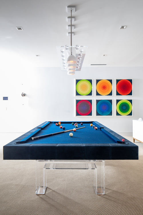
Why Contrast Matters
- Perception of Color: Smooth, glossy surfaces bounce light, making hues appear brighter; matte or rough surfaces absorb light, muting the same paint chip.
- Depth and Dimension: Juxtaposing rough against smooth—or matte next to reflective—creates instant visual hierarchy.
- Lighting Synergy: Uplighting enhances reflective finishes; grazing light dramatizes relief in brick or plaster.
Building a Textural Palette
White and Light Palettes
- Shadows become design features.
- Lean on natural fibers such as linen drapery and sisal rugs.
- Use directional daylight to accent subtle relief.
Neutral Palettes
- Match undertones: warm creams with oak, cool grays with walnut or marble.
- Combine a soft textile, a mid‑sheen metal, and a structured stone for balance.
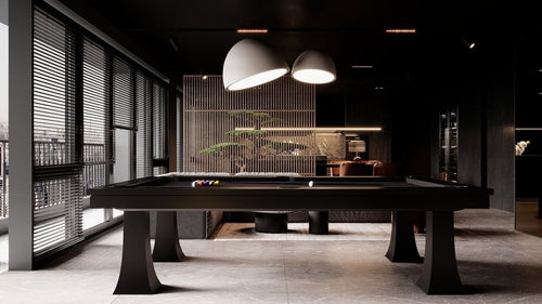
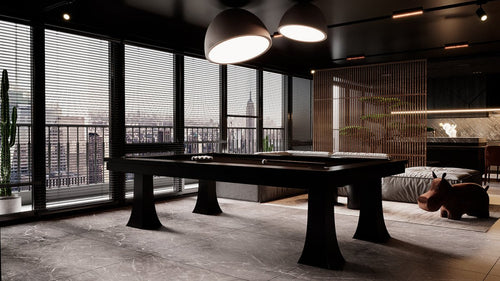
Dark Palettes
- Shadows disappear—lean on sheen and reflection for contrast.
- Introduce at least one lighter accent plane to avoid a cave effect.
- High‑polish stone or lacquer brings sparkle where relief can’t be seen.
Hard vs. Soft Texture Layering
| Hard Layering (Architectural) | Soft Layering (Furnishings) |
|---|---|
| Frosted glass panels | Knubby wool throws |
| Richly grained walnut millwork | Tweed or bouclé upholstery |
| Honed vs. polished stone thresholds | Silky accent pillows |
Hard textures set the backbone; soft textures finish the story with comfort and acoustic control.
Putting It All Together
- Create concept boards with real wood offcuts, fabric swatches, or leaves to convey atmosphere.
- Sketch lighting first so materials play well with natural and artificial illumination.
- Contrast smart, not loud: a matte plaster wall against a sleek stone bar top is powerful without being busy.
- Detail your drawings: note finish codes, gloss levels, pile heights, and grain directions on elevations and isometrics.
- Mock‑up critical transitions where stone meets timber or fabric meets metal to eliminate onsite surprises.
Quick Texture Wins
- Swap a flat rug for a high‑pile wool or sculpted cut‑pile to warm up minimalist spaces.
- Replace one glossy cabinet door with fluted glass to soften an over‑polished kitchen.
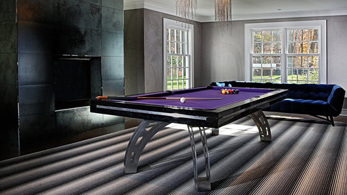
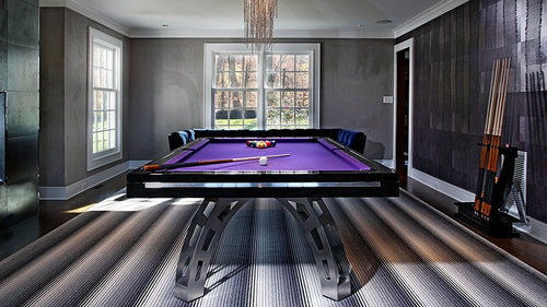
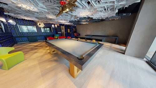
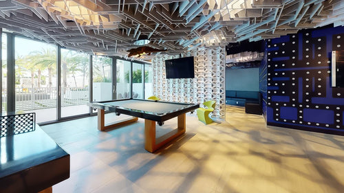
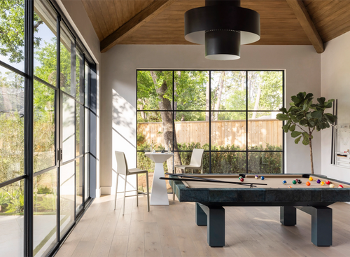
- Layer a matte black game‑table frame against a satin oak floor for understated drama.
Final Takeaway
Texture is color’s silent partner and light’s favorite collaborator. Master their interplay and even the most restrained palette comes alive with depth and character. Aim for layered contrasts, mindful lighting, and a minimum of three complementary textures to keep any space—residential, commercial, or recreational—intentional, tactile, and unmistakably compelling.