Enjoy our modern designs
Color changes what you see and how you feel—not how fast the table plays. Here’s the practical breakdown.
Cloth color affects visibility, glare, perceived cleanliness, and focus. Below is the no-nonsense guide to picking a shade that works for your room and your camera.
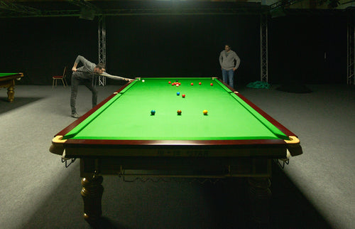
Why green was the default
Billiards grew out of lawn games; early tables kept the “grass” color. Deep greens feel classic and stay easy on the eyes under warm, uneven lighting.
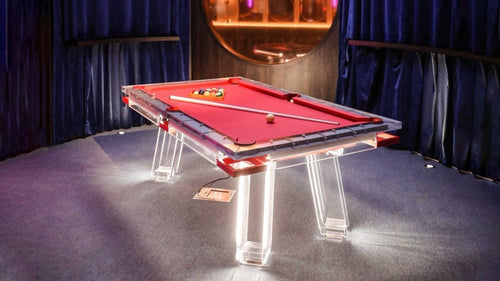
Why blue took over broadcasts
Blue separates ball colors from the cloth better on camera and hides blue-chalk smudges. That’s why “tournament blue” became the TV norm: cleaner image, higher contrast, fewer visible marks.
What color doesn’t change
Speed. Speed is the cloth model (weave, weight, finish) and table prep (humidity, install, cleanliness). Color alone won’t make the table faster or slower.
What color does change
- Contrast & aim: Blue tones usually give the cleanest ball-to-cloth separation.
- Glare & eye strain: Darker greens are forgiving under warm or mixed lighting. Very light cloths can glare under bright LEDs.
- Perceived cleanliness: Blue hides blue-chalk smudges better than pale greys/whites.
- Mood: Blues/greens skew calm/focused; bold reds/oranges feel more “amped.”
Color by use-case
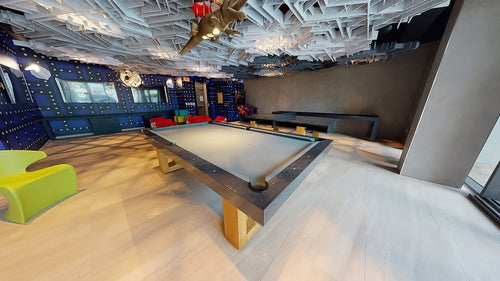
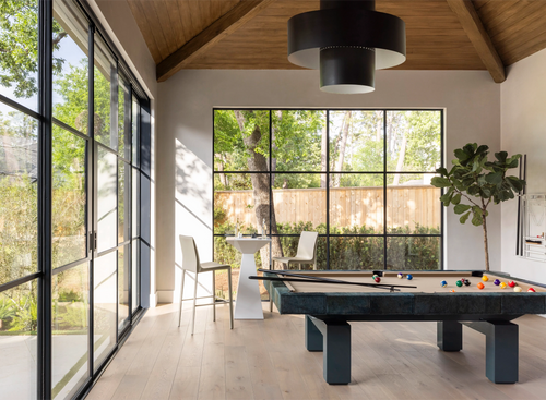
Home game room
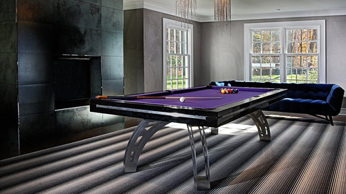
Pick traditional green, tournament blue, or a muted teal. Easy on eyes, hides marks, works with warm lamps.
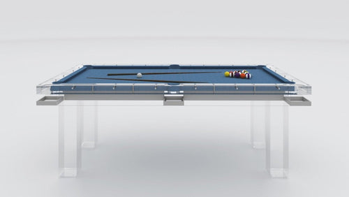
Content creators / streamers
Tournament blue. Best contrast on camera, cleaner look. Light at 5000–5600K with diffusion; avoid mixed color temps.
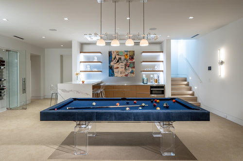
Bars / hospitality
Blue or darker green. Looks clean longer under bright overheads. Avoid ultra-light fashion colors.
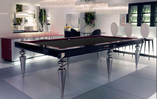
Design-led spaces
Charcoal, deep teal, or very dark green for drama. Test contrast under your actual lights first.
Chalk pairing
Match chalk to your cloth family (blue with blue/green). Mismatch = freckles everywhere; match = cleaner rails and less daily wiping.
Lighting beats pigment
Even, bright, diffused light matters more than the exact shade. For a 9-ft table: daylight-balanced LEDs, good diffusion, no hotspots.
Rule of thumb: if your room is warm-lit, deep green feels best; if you’re on daylight LEDs or filming, blue wins.
Myths to ditch
- “Grey/white plays faster.” — Speed is cloth model/install, not color.
- “Blue is only for TV rooms.” — It’s also practical at home: contrast + hides marks.
- “Red cloth makes you play better.” — Mood nudges exist; skill and setup decide outcomes.
Quick picks (TL;DR)
- Most versatile: Tournament Blue
- Classic club vibe: Deep Traditional Green
- Moody modern: Charcoal / Deep Teal (verify contrast)
- Highest upkeep: Very light colors
Buyer checklist
- Choose cloth model first, color second.
- Test under your lights/camera with real swatches.
- Match the chalk to reduce visible mess.
- Mind the room palette: dark walls + dark cloth = low contrast unless lighting is strong.