Enjoy our modern designs
Estimated Read Time: 5 mins |
Color plays an essential role in shaping how we perceive interior environments, from the mood and function of a space to its overall aesthetic impact. While most of us think of color in terms of how it appears on a screen, it’s important to remember that physical materials—paints, stains, and dyes—rely on pigments, which behave very differently from colored light. Understanding this difference helps designers make informed choices about hue, value, and intensity in real-world contexts.
The Nature of Color Pigments
Pigments are finely ground, insoluble substances suspended in a vehicle (like paint or dye) that determines attributes such as consistency, gloss, and adhesion. Pigmentation—the natural coloration of a surface—allows certain wavelengths of white light to be absorbed, while reflecting others to create the color we see.
Pigment vs. Light
When working with screens (additive color), colors mix by adding light. In contrast, mixing pigments (subtractive color) removes wavelengths of light. Therefore, designers must always test paint swatches or fabric samples under the actual lighting conditions in the space.
Importance for Interior Designers
The choice of pigments influences the final appearance, durability, and even psychological impact of interior surfaces. Designers often rely on physical samples, color matching equipment, and manufacturer color series to ensure accuracy.
Pigment Mixing: Subtractive in Nature
When different pigments are blended, each absorbs certain proportions of white light. The remaining wavelengths reflected by the mixture create the visible hue, value, and intensity:
- Hue: Mixing analogous pigments creates harmoniously related hues, while combining complementary pigments tends to neutralize or reduce saturation.
- Value: Adjusting lightness or darkness can be achieved by tinting with white or shading with black. The overall brightness is key to spatial perception.
- Intensity: Adding more of the dominant hue increases saturation, whereas mixing in a complementary hue or gray reduces intensity for a more muted tone.
Case Study: Vibrant Blue Pool Table in a Modern Lounge

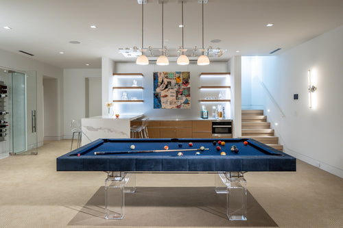
In this striking interior, the custom-made Arock Lucite transparent acrylic-framed pool table with a bright blue felt top takes center stage. Alongside a sweeping blue watercolor-style backsplash and large floor-to-ceiling windows, the space showcases how careful pigment selection can create a cohesive and visually dynamic environment.
Hue Selection and Contrast
The brilliant blue felt works as a bold accent against the neutral whites and grays of the walls, bar counters, and flooring. Complementary gold fixtures overhead add a touch of warmth, offsetting the cool, aquatic palette.
Value and Lighting
Abundant natural daylight highlights subtle shifts in hue and value throughout the day. The high-value (light) walls and bar area create contrast, making the pool table’s hue more pronounced.
Intensity and Focal Point
By keeping most of the surrounding elements relatively neutral, the pool table’s saturated blue becomes an intentional focal point. Even the wallpaper’s aqua tones tie in with the pool table’s felt, demonstrating how consistent use of analogous colors creates visual harmony.
Context and Practical Insights
Designers strategically use bright pigments to draw the eye toward focal areas (such as the pool table and bar shelving) while maintaining a clean, modern feel. Lighting considerations are critical, as natural daylight shows colors accurately, but shifting illumination (such as in the evening) can affect the perceived hue. Durability and maintenance are also key—selecting pigments that stand up to regular cleaning and high-use areas is vital for sustained performance.
Why Pigment Knowledge Matters
Understanding color from the standpoint of subtractive mixing empowers designers to predict how different pigments will interact under varying lighting conditions, create harmonious or dramatic relationships, and select materials that deliver both visual impact and functional performance.
Conclusion
From the vibrant pool table felt to the artful blue backdrop, this interior exemplifies how purposeful pigment choices can breathe life into a space. By understanding how pigments behave—and how light interacts with them—designers can craft memorable, cohesive environments that capture the client’s style while meeting functional requirements. Mastering the subtractive nature of pigment mixing is one of the most powerful tools in an interior designer’s toolkit, turning an ordinary space into a personalized, visually stunning retreat.

