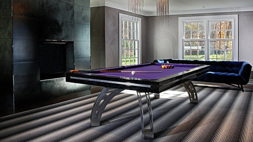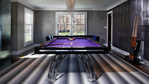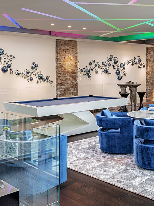

Enjoy our modern designs
Estimated Read Time: 5 mins |
Color is often celebrated as the cornerstone of good interior design. Yet, beyond merely choosing visually pleasing palettes lies a deeper understanding of how we perceive color. Mastering color perception allows interior designers to transform spaces into environments that resonate with users—shaping aesthetics, mood, functionality, and spatial experience.
How We See Color: The Basics of Perception
Visual perception is our brain’s ability to interpret and understand the information received through our eyes. Our view of shapes, textures, sizes, and especially colors is influenced by the surrounding visual environment. Without clear differentiation in tone, color, and texture, distinguishing objects from their background would be a challenge.
The Interplay of Light and Color
Color doesn’t exist without light. It emerges when an object’s surface selectively absorbs and reflects specific wavelengths. Since digital screens emit colored light while physical samples rely on pigments, designers must verify color decisions with tangible samples under real-life lighting conditions.
Three Dimensions of Color: Hue, Value, and Saturation
Professionals categorize color using three interdependent attributes:
- Hue: The actual color (red, blue, green, etc.).
- Value: The brightness or darkness of the color.
- Saturation: The intensity or purity of the hue.
Systems like the color wheel, the Munsell system, and the CIE standards help specify colors precisely, while tools like Pantone offer practical color matching across materials.
Light’s Influence on Color Perception
The type and quality of light significantly affect how colors are seen. Warm, cool, or neutral lighting alters the appearance of colors. Warm lights enhance reds and yellows while muting blues and greens; cool lights intensify cooler hues and subdue warm shades. Illumination levels further impact brightness and intensity perceptions.
Simultaneous Contrast and Color Relationships
When colors are placed together, our eyes create subtle afterimages of complementary hues—a phenomenon known as simultaneous contrast. This effect alters both hue and saturation perceptions, emphasizing the importance of context and careful color positioning in design compositions.
Color’s Power in Shaping Spatial Perception
Color influences how we experience space. Warm, highly saturated colors tend to advance visually, creating an intimate feel, whereas cooler, muted tones recede, making spaces feel larger. Lighter values impart openness, while darker values add depth and coziness, shaping perceptions of scale and distance.
Practical Applications in Interior Design
A deep understanding of color perception informs many design choices. Designers can:
- Craft specific moods and atmospheres tailored to different spaces.
- Predict and accommodate the impact of various lighting conditions.
- Manipulate spatial perception to enhance function and comfort.
- Guide visual interest using strategic contrasts and saturation.
- Ensure accuracy by testing physical samples under intended lighting.
- Align color choices with the overall functional and architectural goals.
Conclusion: Beyond Aesthetics to Experience
Understanding color perception elevates interior design from a purely aesthetic endeavor to a human-centered practice. By mastering these principles, designers can create spaces that are visually stunning, functionally effective, and emotionally resonant. Embracing the art and science of color transforms design into a deeply experiential discipline.