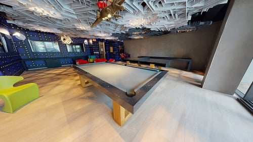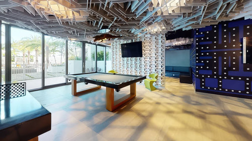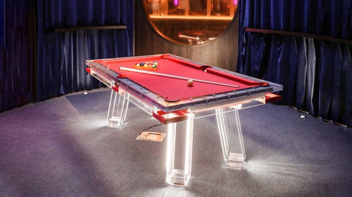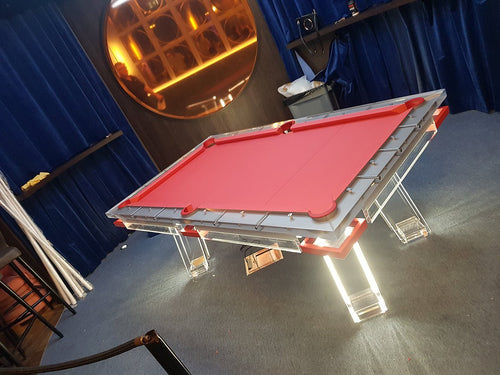


Enjoy our modern designs
Metal accents can make a pool table look sharper, richer, and more architectural. They can also make it look like a showroom gimmick.
Used well, metal adds structure. It defines edges, highlights craftsmanship, connects the table to the room’s hardware, and gives the piece a more tailored presence. Used badly, it feels flashy, mismatched, or decorative in the worst way.
The difference is restraint. Metal should not be treated like jewelry thrown onto a pool table. It should behave like an architectural detail: controlled, purposeful, and connected to the rest of the design.
Table of Contents
1. Metal Should Have a Reason to Exist
The biggest mistake is adding metal just because the table needs “something extra.” That is usually where bad design starts.
Metal accents need a reason. They should support the table’s shape, reinforce the base structure, connect to the room’s finishes, or create a precise contrast with another material. If the metal detail does not improve the table’s proportion, mood, or integration with the room, it probably does not belong.
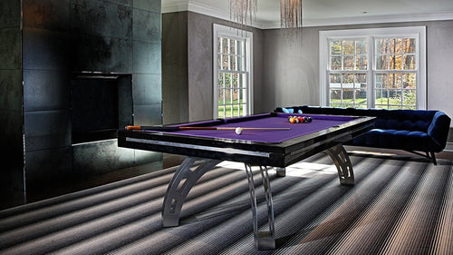
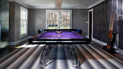
A slim brass reveal between a walnut rail and a dark base can feel refined. A brushed steel support on a modern table can feel structural and honest. A blackened metal leg can make the table feel architectural. Random shiny trim around every edge can quickly feel cheap.
The Pro Insight: Luxury is not more metal. Luxury is better placement. The best metal details look inevitable, not added on later.
2. Match the Metal to the Room’s Hardware
A pool table does not exist alone. It sits inside a room with lighting, door handles, cabinet pulls, bar hardware, furniture legs, stair railings, fireplace details, and possibly metal-framed windows.
The metal on the pool table should speak to those details. That does not always mean every metal must match perfectly. A room can mix metals beautifully, but the mix needs intention.
The safest approach is to identify the dominant metal language in the room. Is it warm, cool, dark, polished, brushed, aged, or industrial? Then choose the table accents accordingly. Metal should help the table belong.
3. Understand Metal Finishes
The finish of the metal matters as much as the metal itself. Brass, chrome, bronze, stainless steel, and black metal can each look expensive or cheap depending on finish, scale, and placement.
| Metal Finish | Design Effect | Main Risk |
|---|---|---|
| Polished Metal | Reflective, glamorous, high-contrast. | Can look flashy or show fingerprints easily. |
| Brushed Metal | Softer, quieter, more residential. | Can feel bland if used without contrast. |
| Aged or Patinated Metal | Warm, relaxed, mature, tactile. | Can look muddy in a dark room. |
| Matte Black Metal | Modern, architectural, controlled. | Can look flat if the table lacks material contrast. |
4. Use Metal as Punctuation
Metal accents work best when they are used like punctuation: a reveal line, a foot cap, a pocket trim, a support bracket, a base detail, a thin inlay, or a controlled edge.
These small moments can elevate the table without overwhelming it. The problem starts when metal becomes decorative filler. Too many strips, oversized corner caps, unnecessary logos, shiny bolts, or ornamental plates can make the table feel less expensive, not more.
A good rule: the more reflective the metal, the less of it you need. A thin polished chrome accent can look sophisticated. Large polished chrome surfaces can quickly feel aggressive. Brushed or blackened metal can usually handle more presence because it is quieter, but even then, proportion matters.
5. Choosing the Right Metal
Different metals create different moods. The right choice depends on the table material, the felt color, the surrounding room, and how much shine the space can support.
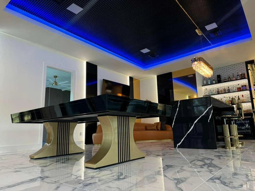
- Brass: Warm, elegant, and rich. Best with walnut, black lacquer, marble, navy felt, olive felt, leather seating, warm lighting, and Art Deco or club-inspired rooms. Avoid overly yellow, shiny, or oversized brass.
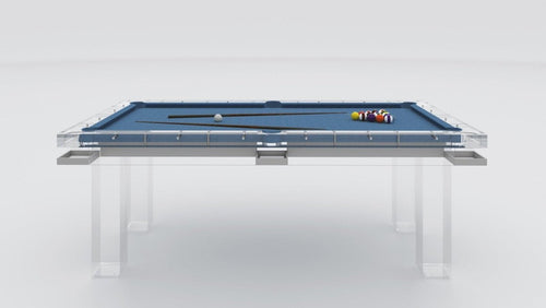
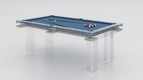
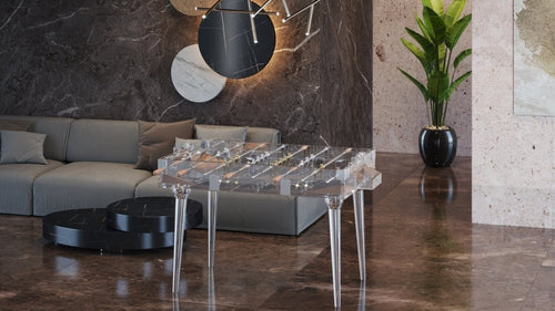
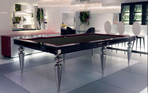
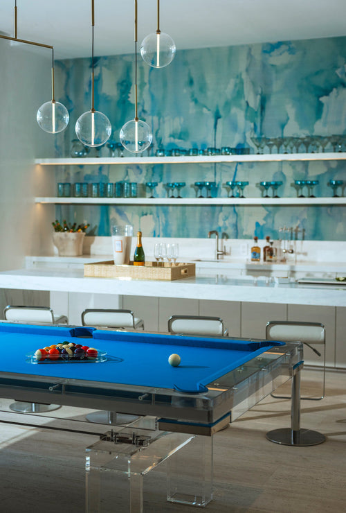
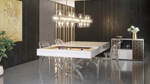
- Chrome and Polished Nickel: Sleek, reflective, and unforgiving. Best with acrylic, black lacquer, white lacquer, marble, glass, sculptural lighting, and high-contrast interiors. Cheap chrome looks cheap immediately.
- Blackened Steel and Matte Black Metal: The safest modern choice. Works with walnut, oak, marble, leather, acrylic, charcoal felt, olive felt, black felt, and rooms with black architectural details.
- Bronze: Richer and more mature than brass. Excellent with walnut, dark woods, stone, leather, olive felt, navy felt, taupe felt, and warm neutral interiors.
- Stainless Steel: Clean, practical, and contemporary. Best in modern, industrial, minimalist, acrylic, black, charcoal, concrete, or brushed-metal-heavy interiors.
6. Where Metal Works Best
Metal works best when it feels structural, functional, or quietly integrated. The base, pockets, feet, caps, and small reveal lines are usually safer than large decorative rail surfaces.
| Placement | Why It Works |
|---|---|
| Base | Feels structural rather than decorative. Metal legs, crossbars, brackets, or pedestal supports can make the table feel architectural. |
| Pockets | Small, visible, and detail-oriented. Thin trim can tailor the table without overwhelming it. |
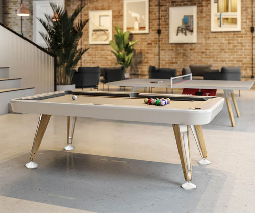
| Feet and Caps | Adds a quiet luxury detail, protects the base, and connects the table to nearby hardware. |
| Rails | High-risk. Rail metal needs to be minimal, smooth, comfortable, durable, and glare-conscious. |
7. Avoid Fake Luxury Signals
Some metal details instantly make a pool table feel cheaper. The worst offenders are usually oversized shiny gold trim, random chrome strips, decorative plates with no purpose, visible low-quality screws, fake brass that looks too yellow, plastic-looking metallic finishes, thin plating that scratches easily, too many mixed metals with no logic, large logos, or metal accents that do not match anything in the room.
This is the difference between luxury and luxury cosplay. A table does not look expensive because it has shiny parts. It looks expensive because the materials are real, the proportions are right, the details are controlled, and every choice feels connected.
The Pro Insight: Cheap metal tries to impress you immediately. Good metal gets better the longer you look at it.
8. Match Metal to Interior Style
| Interior Style | Best Metal Direction |
|---|---|
| Modern | Black metal, brushed stainless steel, chrome, polished nickel, or very controlled brass. |
| Traditional | Brass, bronze, antique brass, aged nickel, or dark metal. |
| Transitional | Brushed brass, bronze, black metal, or polished nickel used with restraint. |
| Industrial | Blackened steel, raw steel, brushed stainless, dark bronze, or matte black metal. |
| Coastal | Brushed nickel, champagne brass, pale bronze, or subtle black. |
| Art Deco or Glamorous | Polished brass, chrome, nickel, bronze, lacquer, marble, and strong contrast, but with discipline. |
The Bottom Line
Metal accents can absolutely elevate a pool table. They can make it feel more architectural, more tailored, and more connected to the rest of the room. But metal is not automatically luxurious.
Bad metal looks cheap because it is usually too shiny, too large, too random, or too disconnected from the room. Good metal looks expensive because it is restrained, well-finished, correctly scaled, and used with purpose.
The best pool tables do not use metal to show off. They use it to sharpen the design. A thin bronze reveal, a blackened steel base, a brushed brass pocket detail, a polished nickel accent on an acrylic table, or a small metal foot that ties into the room’s hardware can make the whole table feel finished.