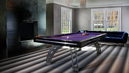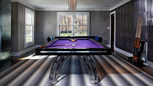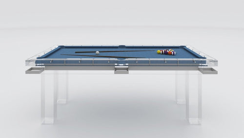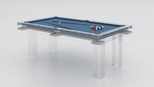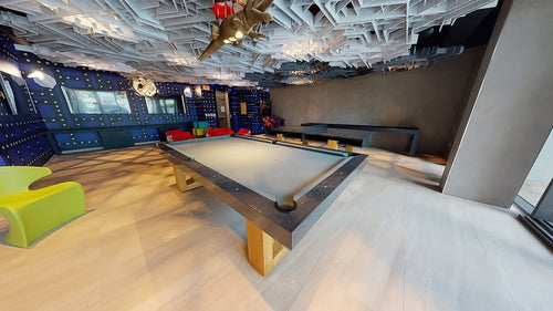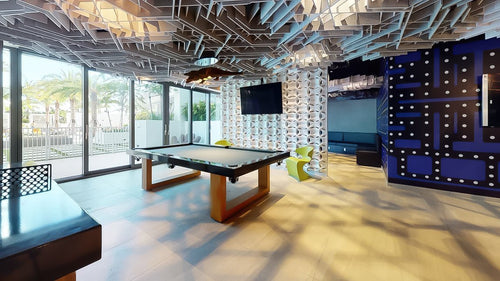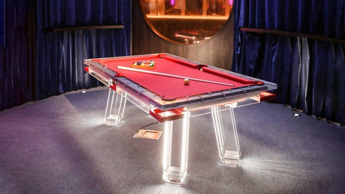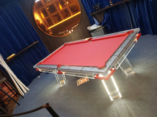


Enjoy our modern designs
Most people choose pool table felt by looking at the color itself.
That is already the wrong starting point.
The smarter way is to think in terms of tone temperature first: warm or cool. That is what determines whether the felt actually belongs in the room or fights it.
A felt color can be beautiful in isolation and still look wrong in the space. Not because the color is bad, but because the temperature is off. This is one of the biggest reasons a pool table can feel disconnected from an otherwise good interior.
Warm vs. cool felt tones is not abstract design theory. It is one of the fastest ways to make a table feel either custom and integrated or random and product-like.
Table of Contents
- What Warm and Cool Felt Tones Actually Mean
- Why Felt Temperature Matters
- Warm Felt Tones
- Cool Felt Tones
- Why Warm Tones Usually Feel More Bespoke
- Why Cool Tones Usually Feel More Controlled
- Warm Felt and Wood Pairings
- Cool Felt and Stronger Contrast
- Where Buyers Usually Mess This Up
- Softening vs. Sharpening the Table
- Which Looks More Expensive?
- My Straight Opinion
- Final Thoughts
What Warm and Cool Felt Tones Actually Mean
Warm felt tones carry more earthy, golden, olive, brown, rust, camel, taupe, or muted yellow-red undertones.
Cool felt tones carry more blue, slate, charcoal, cool green, steel grey, icy grey, or blue-violet undertones.
This matters because the undertone changes how the table interacts with wood finishes, flooring, wall color, nearby upholstery, metal accents, natural light, and the overall emotional feel of the room.
Two greens can behave very differently. One may feel organic and warm. Another may feel sharper and cooler. Same general color family, totally different effect in the room.
Why Felt Temperature Matters So Much
The felt is the biggest uninterrupted color field on the table. That gives it real power.
It is not a small accent. It is often the dominant visual surface. So its temperature has a major effect on whether the table feels cozy or crisp, grounded or sharp, soft or severe, collected or disconnected, furniture-like or sporty.
This is why temperature often matters more than the exact named color.
Warm Felt Tones: Softer, Richer, More Residential
Warm felt tones usually make a pool table feel more inviting and more interior-aware.
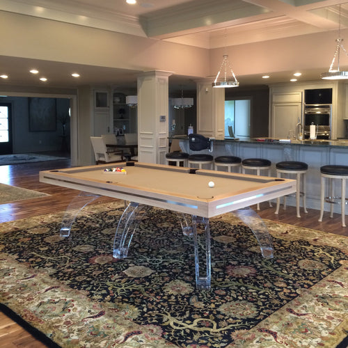
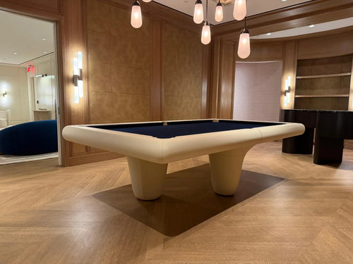
They tend to sit better in homes that already lean warm, layered, organic, or quiet-luxury. They connect naturally with woods like walnut, warm oak, smoked oak, and other materials that have brown, bronze, honey, or earthy undertones.
Warm felt tones often include:
- olive
- moss
- taupe
- camel-adjacent neutrals
- rust-leaning burgundies
- warm charcoal
- deep earthy brown-greys
- muted khaki-like tones in some custom settings
These tones usually help the table feel more like furniture and less like equipment.
Warm Felt Works Best When the Room Has:
- walnut or warm wood tones
- brass or bronze accents
- linen, boucle, leather, or natural fibers
- creamy or earthy walls
- a soft or layered palette
- a more relaxed, tailored atmosphere
Warm tones can be especially strong in living rooms, luxury dens, dining-conversion spaces, and homes where the table needs to feel integrated rather than high-contrast.
Cool Felt Tones: Sharper, Cleaner, More Architectural
Cool felt tones usually make a table feel crisper, more graphic, and more modern.
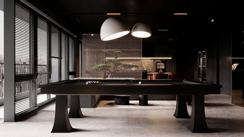
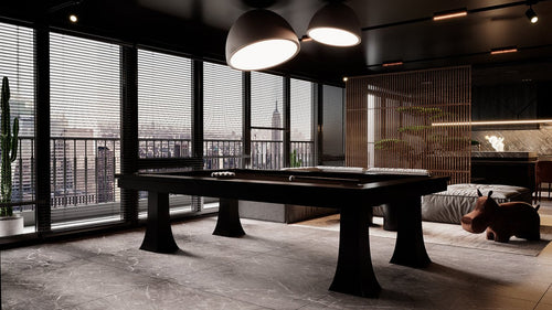
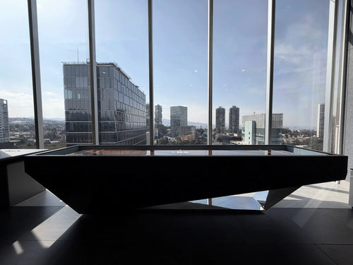
They pair naturally with blackened steel, cooler whites, concrete, chrome or stainless in some interiors, charcoal and black finishes, cooler greys, and strong modern contrast.
Cool felt tones often include:
- navy
- slate blue
- cool charcoal
- steel grey
- blue-based black
- cool emeralds
- cooler classic blue-greens
These tones usually give the table more edge. They can make it feel more formal, more sculptural, or more intentionally modern.
Cool Felt Works Best When the Room Has:
- sharper modern lines
- cooler stone or concrete
- black framing or steel details
- a more minimal palette
- stronger contrast
- gallery-like or architectural energy
Cool tones can be excellent in penthouses, modern lofts, and contemporary homes where the table is supposed to feel crisp rather than cozy.
Warm Tones Usually Feel More Bespoke
This is my straight opinion.
In most upscale homes, warm felt tones often look more bespoke because they feel less expected and more integrated with the types of materials designers actually use in residential spaces.
A warm olive or taupe often looks more custom than standard blue or standard green. It suggests the felt was chosen as part of the room, not just selected from a default billiards menu.
That matters.
Warm tones usually reduce the “game room” energy and replace it with more residential sophistication.
Cool Tones Usually Feel More Controlled
Cool felt tones can look very expensive too, but in a different way.
They tend to feel more disciplined, more graphic, more urban, more modern, and more contrast-driven.
A great navy or cool charcoal felt can look incredibly polished, especially on darker woods or more sculptural tables. The effect is often sharper and more formal than warm felt.
So this is not a warm-good, cool-bad situation. It is about the emotional role you want the table to play.
Warm Felt Pairs Better With Certain Woods
Warm felt tends to look especially good with:
- walnut
- medium to warm oak
- smoked oak
- darker brown woods
- bronzed or antique metals
- leather-wrapped details
That is because the undertones support each other instead of fighting.
A warm olive felt on walnut can feel rich and collected. A taupe felt on white oak can feel soft and architectural. A warm charcoal on smoked oak can feel tailored without feeling cold.
These are the types of combinations that make a table look expensive in a subtle way.
Cool Felt Pairs Better With Cleaner, Stronger Contrast
Cool felt tends to work especially well with:
- black finishes
- charcoal frames
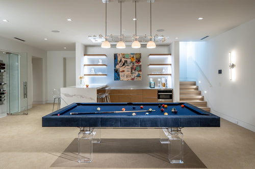
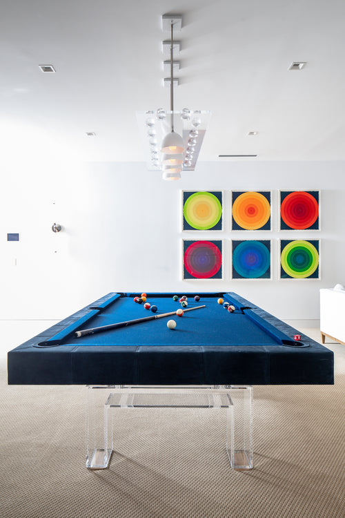
- Lucite bases
- blackened steel
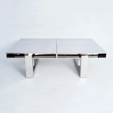
- stainless in controlled settings
- cooler white oak tones
- darker modern lacquers
A navy felt on blackened steel and walnut can feel deeply tailored. A cool charcoal on a black or dark oak table can feel sleek and severe in a good way. A slate blue in a modern architectural room can work beautifully if everything else supports it.
Cool tones are better when you want a little more edge.
Where Buyers Usually Mess This Up
They choose felt as if it is a standalone color chip.
That is the mistake.
What matters is how the undertone interacts with the room. A room with creamy walls, warm oak floors, brass details, and linen upholstery usually does not want a cold, steely felt tone unless you are creating intentional contrast very carefully.
Likewise, a very modern room with cool stone, black window frames, and strong contrast may not want a muddy warm felt tone that makes the table feel too soft.
The felt has to either harmonize or contrast on purpose. Not accidentally.
Warm Tones Soften. Cool Tones Sharpen.
If a table feels a little too hard, too sharp, or too modern, warm felt is often the answer.
Warm felt can add richness, reduce severity, connect the table to surrounding natural materials, make the room feel more relaxed, and make the pool table feel more residential.
This is one reason olive and taupe keep showing up in more design-conscious pool table projects.
If a table feels too soft, too traditional, or not visually defined enough, cool felt can help sharpen it.
Cool felt can add clarity, increase contrast, make the piece feel more modern, give the table more graphic presence, and create a stronger focal point.
This is why navy and cool charcoal remain such strong choices.
Which Looks More Expensive?
Again, it depends on the room.
If the room is warm, layered, and residential, warm felt usually looks more expensive because it feels integrated.
If the room is modern, crisp, and contrast-driven, cool felt usually looks more expensive because it feels correct.
The expensive look is not about the felt tone by itself. It is about whether the temperature makes sense with the rest of the space.
My Straight Opinion
For most upscale residential interiors, warm felt tones are the smarter move.
Not because cool tones are bad. They are not. But warm tones usually feel more custom, more furniture-aware, and less default. Olive, taupe, warm charcoal, and earthy deep neutrals often look far more bespoke than the standard cool options people reach for automatically.
That said, navy is the cool-tone exception that works in a lot of homes. It behaves almost like a neutral and can feel classic, rich, and controlled without being harsh.
So if someone is unsure, go warm for softer luxury, designer-led integration, and a more residential feel. Go cool for sharper modernity, stronger contrast, and a more graphic look.
Final Thoughts
Warm vs. cool felt tones change the emotional temperature of the whole table.
Warm tones make it feel richer, softer, and more integrated. Cool tones make it feel sharper, cleaner, and more architectural.
That is the actual choice.
When the felt temperature matches the room, the table feels like it belongs there. When it does not, even an expensive table can feel oddly disconnected.
That is why this decision matters more than most buyers realize.