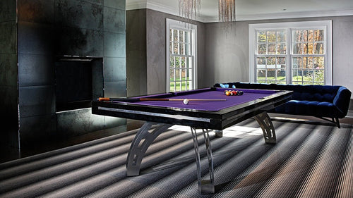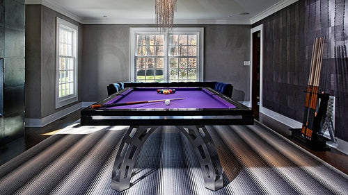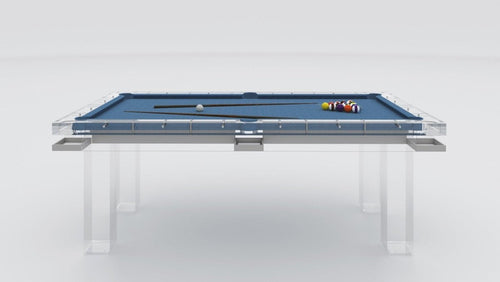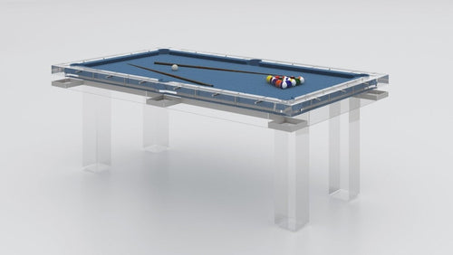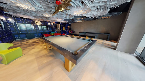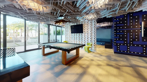


Enjoy our modern designs
Pool table felt used to be simple. You picked green because that was the default, or maybe tournament blue if you wanted something sportier. But in a designed home, especially a luxury interior, felt color is not just a game-surface decision. It is a major visual choice.
The felt is the largest uninterrupted color field on the table. It sits directly in the center of the room, catches the eye immediately, and affects how the table relates to the surrounding furniture, flooring, walls, lighting, and materials.
For many interiors, the best felt colors are not loud. They are dark, muted, architectural, and easier to integrate into a serious room. Black, charcoal, navy, taupe, and olive are some of the strongest choices because they feel intentional without looking gimmicky.
Table of Contents
1. Why Felt Color Matters More Than People Think
A pool table is already a large object. Even a beautifully designed table has visual weight. Once you add a strong felt color, the table can either feel integrated or completely disconnected from the room.
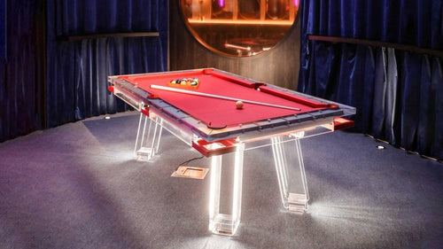
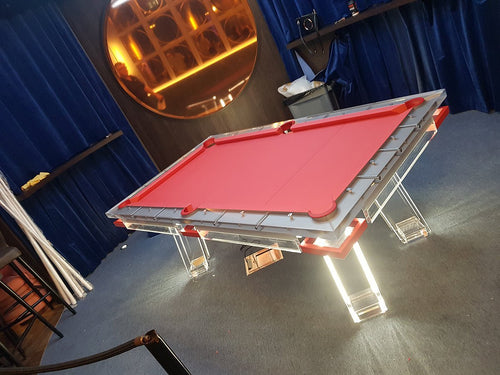
A bright green cloth can look perfect in a traditional billiards room, but it may feel too recreational in a modern living room. A bold red felt can work in very specific entertainment spaces, but it often becomes the loudest thing in the room. A tournament blue cloth may be great for competitive play, but it can look too sporty for a refined residential interior.
Neutral and muted felt colors give designers more control. They allow the table to feel like furniture, not equipment. The goal is balance: enough contrast to make the table feel alive, but not so much color that it fights the rest of the space.
2. Black Felt
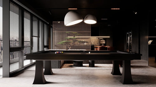
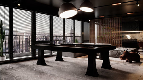
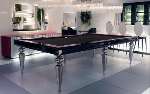
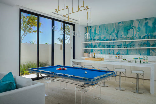
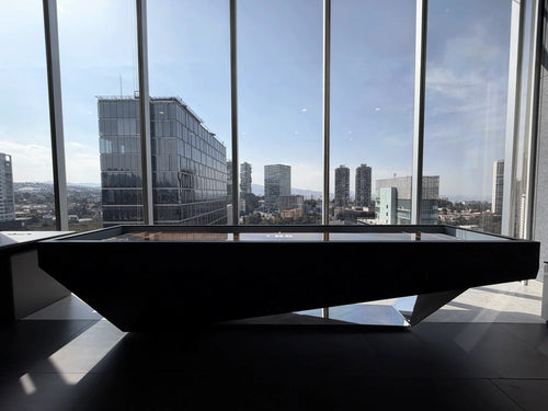
Black felt is bold, clean, and dramatic. It gives a pool table a sleek, modern presence and works especially well in rooms that already use strong contrast.
A black felt surface can make a table feel sharper and more architectural. It pairs naturally with black lacquer, dark walnut, smoked glass, acrylic, chrome, brushed metal, and high-contrast interiors. In the right space, it can look incredibly polished.
- Best For: Contemporary game rooms, penthouses, modern lounges, dark media rooms, masculine interiors, black-and-white spaces, and acrylic or Lucite pool tables.
- Pairs With: Black lacquer, dark walnut, polished chrome, brushed stainless steel, smoked glass, white marble, acrylic, dark leather, and charcoal upholstery.
- Watch Out For: Black can flatten the table in a room that is already very dark. It can also show dust, chalk, lint, and pet hair more clearly.
Designer Take: Black felt is best when the room has confidence. Use it when the table is meant to feel sharp, modern, and intentional.
3. Charcoal Felt
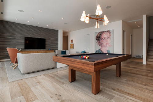
Charcoal is probably the most versatile felt color for luxury interiors. It has the sophistication of black, but it is softer and easier to live with.
A charcoal felt surface feels modern without being aggressive. It works with both warm and cool palettes, which makes it a strong choice for designers who want the table to feel integrated rather than dominant.
- Best For: Modern homes, transitional interiors, apartments, townhouses, penthouses, formal lounges, and mixed-use entertainment rooms.
- Pairs With: Walnut, black oak, white oak, matte black metal, brushed nickel, concrete, stone, grey upholstery, cream walls, and leather seating.
- Watch Out For: Charcoal can feel lifeless in an all-grey interior. Add warmth through wood flooring, leather chairs, brass accents, warm lighting, or textured walls.
Designer Take: Charcoal is the safest designer choice, but not in a bad way. It is controlled, flexible, and hard to regret.
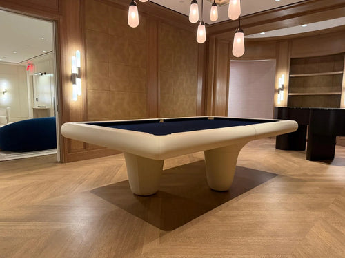
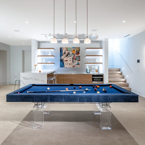
4. Navy Felt
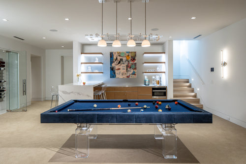
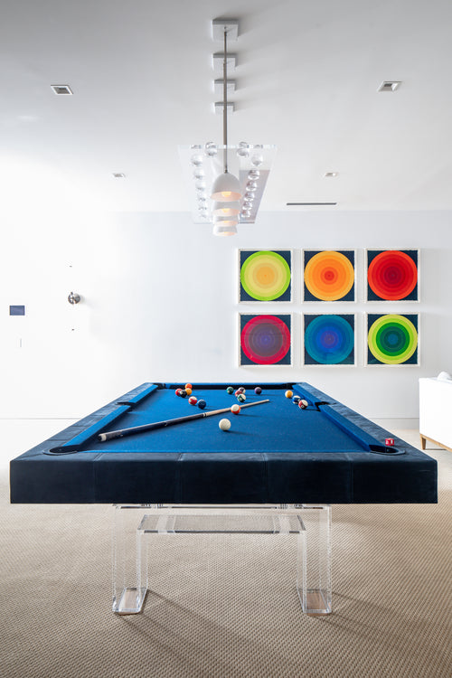
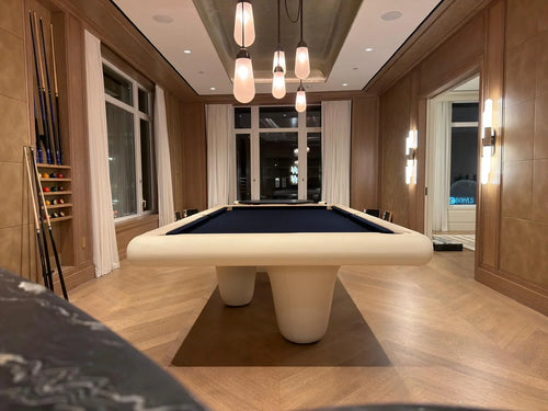
Navy felt has more personality than black or charcoal, but it still feels mature. It brings color into the room without becoming loud.
Navy can lean classic, coastal, masculine, preppy, nautical, or contemporary depending on the table and room around it. It gives a pool table a rich, tailored feeling without becoming playful or gimmicky.
- Best For: Coastal homes, formal lounges, traditional game rooms, Hamptons-style interiors, yacht-inspired spaces, transitional interiors, and rooms with blue, cream, walnut, or brass accents.
- Pairs With: Walnut, mahogany, white oak, brass, bronze, cream upholstery, white walls, blue accents, leather, and natural fiber rugs.
- Watch Out For: Navy undertones vary. Some lean purple, some green, and some royal blue. Always check samples in the actual room lighting.
Designer Take: Navy is the best choice when you want color with discipline. It feels richer than charcoal and less severe than black.
5. Taupe Felt
Taupe felt is understated, warm, and quietly luxurious. It is the least “game room” color on this list, which can be a major advantage in residential interiors.
Taupe makes the pool table feel more like furniture. It softens the visual impact of the table and works especially well in rooms with warm neutrals, natural textures, stone, oak, linen, plaster, and muted palettes.
- Best For: Modern organic interiors, minimalist homes, neutral living spaces, formal lounges, desert homes, Mediterranean interiors, coastal homes, and open-plan spaces.
- Pairs With: White oak, natural walnut, travertine, limestone, cream upholstery, beige rugs, plaster walls, bronze, light leather, and warm metal accents.
- Watch Out For: Taupe can lack contrast if paired with an overly light frame in a beige room. Use the rail, base, lighting, or nearby furniture to create definition.
Designer Take: Taupe is the most interior-design-friendly choice. It is calm, warm, and elegant when the table needs to belong quietly.
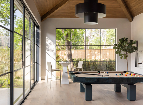
6. Olive Felt
Olive felt is the most interesting choice on this list. It has a connection to traditional green felt, but it feels more muted, mature, and design-forward.
Where bright green can feel recreational, olive feels earthy and architectural. It works beautifully with woods, leathers, stone, bronze, blackened metal, and warm neutrals.
- Best For: Rustic-modern homes, mountain houses, masculine lounges, organic modern interiors, traditional game rooms, library-style spaces, and material-rich interiors.
- Pairs With: Walnut, blackened oak, brown leather, bronze, brass, stone, forest green accents, cream walls, charcoal upholstery, and natural rugs.
- Watch Out For: Olive is sensitive to undertone. Some versions look elegant and muted, while others can look too military, muddy, or yellow.
Designer Take: Olive is the best choice when you want the table to feel personal, warm, and less expected.
7. Comparing the Five Colors
| Felt Color | Best Quality | Main Risk |
|---|---|---|
| Black | Most dramatic and modern. | Can feel severe or show dust easily. |
| Charcoal | Most versatile and refined. | Can feel dull in grey-heavy rooms. |
| Navy | Best classic color option. | Can become too themed if overused. |
| Taupe | Most subtle and interior-friendly. | Can wash out without contrast. |
| Olive | Most distinctive and personal. | Can shift muddy or military depending on undertone. |
8. How to Choose the Right Felt Color
The easiest mistake is picking the felt color you like in isolation. That rarely works. Felt should be chosen in relation to the full room.
Start with the table’s frame. A black table with black felt creates a very different effect than a walnut table with black felt. A white oak table with taupe felt feels quiet and tonal. A walnut table with navy felt feels richer and more traditional.
Then look at the room’s undertones. Are the metals brass, bronze, chrome, or black? Are the walls white, cream, grey, green, or dark? Is the floor pale oak, dark wood, stone, or carpet? Lighting matters too. A felt color that looks perfect in daylight may look dull or strange under warm evening lights.
9. Quick Designer Recommendations
- Choose Black Felt If: You want the table to feel bold, modern, and dramatic.
- Choose Charcoal Felt If: You want the safest refined option for modern, transitional, or open-plan interiors.
- Choose Navy Felt If: You want color without losing sophistication.
- Choose Taupe Felt If: You want the table to feel soft, warm, and integrated.
- Choose Olive Felt If: You want something distinctive but still tasteful.
The Bottom Line
There is no single best felt color. Black, charcoal, navy, taupe, and olive can all be beautiful choices. The difference is context.
Black makes a table feel dramatic. Charcoal makes it feel versatile. Navy makes it feel tailored. Taupe makes it feel calm. Olive makes it feel personal. A well-chosen felt color does not just make the table look better. It makes the entire room feel more resolved.