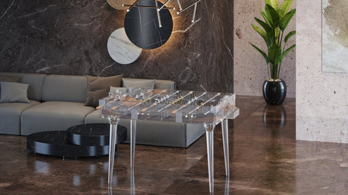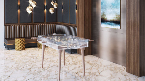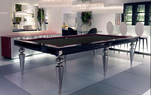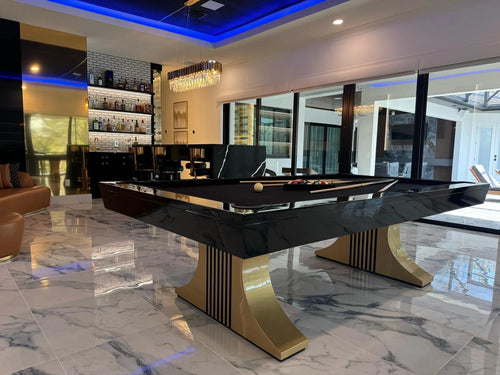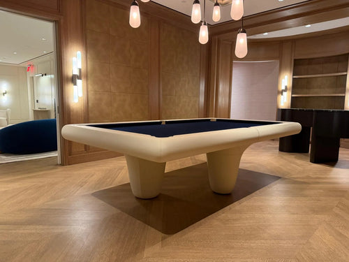


Enjoy our modern designs
A pool table should belong to the room, but it should not disappear into it.
That is where many luxury interiors make a mistake. The designer or homeowner becomes so focused on coordination that every finish starts repeating itself. The table wood matches the floor. The felt matches the sofa. The metal accents match the lighting. The leather pockets match the chairs. The result may be technically cohesive, but it often feels lifeless.
A room needs harmony, but it also needs tension. Without contrast, even expensive interiors can start to feel like a showroom package: tasteful, controlled, and strangely forgettable.
Table of Contents
- 1. Matching Is Not the Same as Belonging
- 2. Over-Matching Makes Luxury Feel Staged
- 3. The Pool Table Needs Its Own Presence
- 4. Felt Is Usually Where Over-Matching Goes Wrong
- 5. Wood Tones Should Talk, Not Match Exactly
- 6. Metal Accents Do Not Need to Copy Every Fixture
- 7. Contrast Is What Makes a Room Feel Designed
- 8. The Best Rooms Have One Clear Lead
- The Bottom Line
1. Matching Is Not the Same as Belonging
A common instinct in interior design is to make a large piece fit by matching it to the materials around it. If the room has walnut floors, the table becomes walnut. If the room has black metal lighting, the table gets black metal details. If the sofa is navy, the felt becomes navy.
On paper, the logic feels safe. The problem is that safe coordination can quickly become visual repetition. When every element repeats the same tone, the room loses depth. The eye has nowhere interesting to go.
A pool table belongs to the room when it respects the palette, scale, mood, and architecture. It does not need to duplicate every material in the space. Belonging is about compatibility, not imitation.
2. Over-Matching Makes Luxury Feel Staged
The fastest way to make an expensive room feel less personal is to make everything look like it was ordered from the same design board.
This is the danger of over-matching. The room may look polished, but it can also feel too solved. Every material confirms the next one. Every color repeats itself. Every finish behaves exactly as expected.
Luxury interiors need some evidence of judgment. Not chaos, not randomness, but judgment. The confidence to let a pool table be slightly darker than the floor. The restraint to choose felt that supports the palette without copying the sofa. The discipline to use metal accents only where they add structure.
3. The Pool Table Needs Its Own Presence
A pool table is naturally central. It is large, horizontal, and usually placed where people gather. Trying to make it blend completely into the room often weakens the reason it is there.
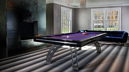
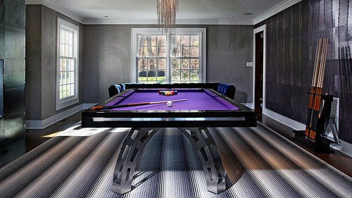
The table should have presence. It should anchor the space, organize movement, and give the room a social center. If the table is too visually absorbed by the surrounding finishes, it may stop feeling intentional and start feeling like another surface in the room.
Presence does not have to mean loud. It can come from proportion, silhouette, material contrast, or a subtle shift in tone.
The Pro Insight: The best pool tables do not copy the room. They converse with it.
4. Felt Is Usually Where Over-Matching Goes Wrong
Felt is one of the easiest places to make a room feel too coordinated. A homeowner sees blue in the artwork or sofa and chooses blue felt. A designer sees taupe upholstery and selects taupe felt. Someone wants the room to feel seamless, so the playing surface becomes almost the same tone as the surrounding furniture.
Sometimes that works, but often it flattens the entire room. The felt is not a throw pillow. It is a large color field at the center of the space.
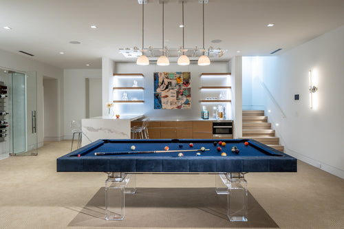
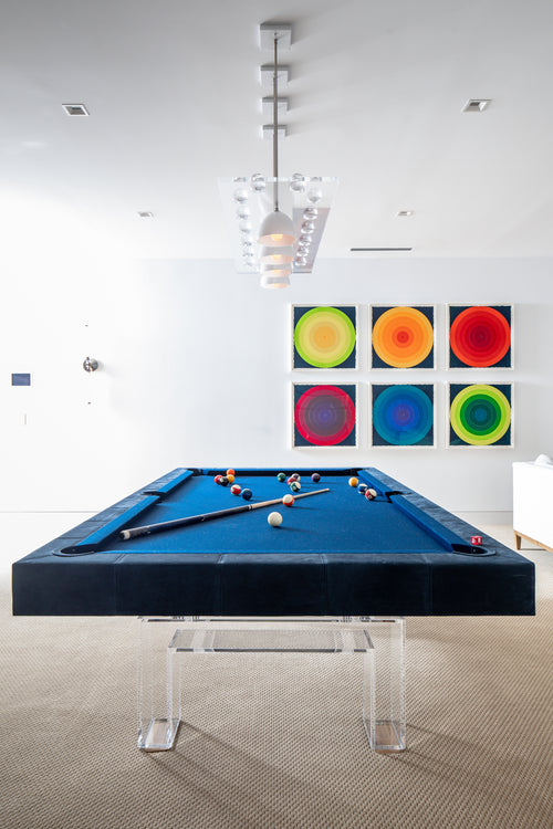
A better approach is to choose felt that relates to the room without directly copying it. Navy can work beautifully in a neutral room even if there is no other navy present. Charcoal can give structure to pale stone and light upholstery. Olive can bring depth to rooms with walnut, leather, or warm neutrals.
5. Wood Tones Should Talk, Not Match Exactly
Wood matching is another common trap. People often assume that if the floor is walnut, the table should be walnut in the same tone. If there is oak millwork, the table should follow it exactly. This can work in some interiors, but it can also create a heavy, monotonous look.
Wood is more interesting when the tones are related rather than identical. A table can be slightly darker than the floor to create grounding. It can be warmer than surrounding cabinetry to add richness. It can use a different grain direction or finish sheen to separate itself subtly from the architecture.
A deliberate contrast usually looks more confident than an imperfect match.
6. Metal Accents Do Not Need to Copy Every Fixture
Metal is often treated too literally. If the room has brass lighting, the pool table gets brass. If the room has blackened steel doors, the table gets black metal. If cabinet hardware is polished nickel, someone tries to pull that into the table as well.
This can become predictable quickly. Metal accents on a pool table should be used for structure, rhythm, or refinement, not just repetition.
The question should not only be, “What metal is already in the room?” The better question is, “What does the table need?” Sometimes the table needs contrast. Sometimes it needs quietness. Sometimes it needs no visible metal at all.
7. Contrast Is What Makes a Room Feel Designed
A good interior is not built from matching alone. It is built from relationships: light against dark, smooth against textured, warm against cool, heavy against light, soft against architectural.
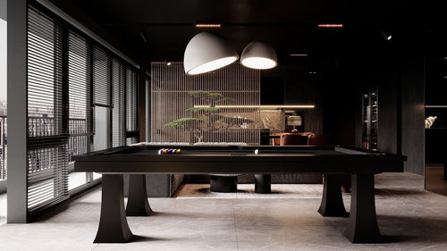
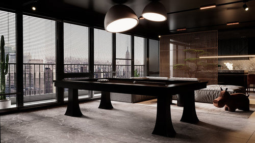
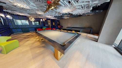
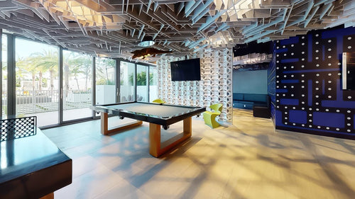
A pool table can participate in those relationships beautifully. In a pale room, a darker table can create gravity. In a room with strong architecture, a softer table can make the space more livable. In a heavily textured room, a clean-lined table can bring calm. In a minimal space, a warm wood table can prevent the room from feeling sterile.
| If the Room Feels... | The Table May Need... |
|---|---|
| Too pale | Depth, darker wood, charcoal felt, or stronger base presence. |
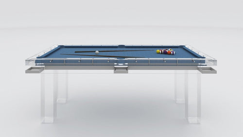
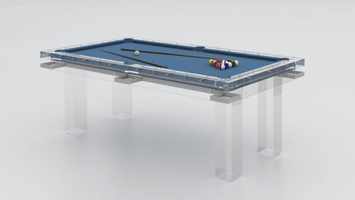
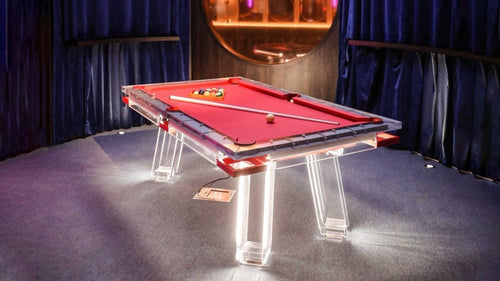
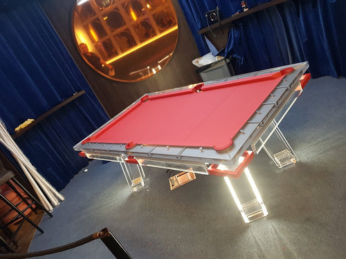
| Too heavy | Lightness, cleaner geometry, Lucite, or a softer felt color. |
| Too formal | Ease, warmth, leather, texture, or a more residential finish. |
| Too minimal | Warmth, grain, tactile materials, or controlled contrast. |
8. The Best Rooms Have One Clear Lead
The problem with over-matching is often that everything is treated with the same level of importance. The table, floor, lighting, seating, walls, bar, and accessories all try to agree with each other equally. The room becomes coordinated, but not composed.
A better room has hierarchy. Sometimes the pool table is the lead, and the surrounding furniture supports it. Sometimes the architecture is the lead, and the table stays quieter. Sometimes the view is the lead, and the table needs to anchor the space without competing.
Once the lead is clear, the table becomes easier to design. It either steps forward or settles back. It either adds contrast or reinforces calm. What it should not do is blindly match everything around it.
The Bottom Line
The best pool table for a room is rarely the one that matches the most. It is the one that understands what the room is missing.
If the room is pale, it may need depth. If it is heavy, it may need lightness. If it is formal, it may need ease. If it is minimal, it may need warmth. If it is traditional, it may need a cleaner line to keep the space from feeling dated.
Over-matching tries to prove taste through agreement. Better design proves taste through balance. A pool table should have enough confidence to belong without disappearing.